Overview


The First Abu Dhabi Bank (FAB) Mobile App redesign aimed to elevate the digital banking experience for one of the UAE’s largest financial institutions. FAB faced challenges around user engagement, complex navigation and evolving customer expectations. The redesign focused on improving usability, modernising the visual experience, and increasing transactional efficiency across key user journeys in the mobile app.
The Challenge

FAB’s existing app had low engagement and complex flows that made common tasks harder than necessary. Users struggled with onboarding, transaction management, and discovering features that could make banking more efficient. With an increasingly competitive digital finance landscape, FAB needed a solution that was user-centric, secure, and aligned with modern mobile expectations.

Research & Insights

Competitor & Market Analysis

We analysed leading banking apps to understand best practices and opportunities for differentiation. Insights included the importance of intuitive navigation, personalised dashboards, real-time notifications, and seamless transaction paths. Security features such as biometric options and proactive alerts emerged as critical for trust.

Stakeholder & User Understanding

Workshops and interviews with FAB stakeholders ranging from executives to front-line customer support staff helped us form a proto-persona representing core user segments. This informed priority journeys and focus areas for redesign.

Ideation & User Flows

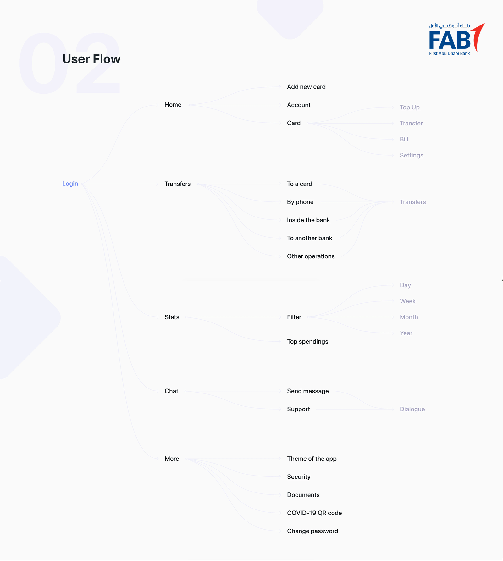
With research outputs in hand, we facilitated co-creation sessions to map the app’s information architecture and core user flows. These focused on typical banking tasks:

  • Onboarding

  • Money transfers

  • Bill payments

Interactive sketches and wireframes allowed rapid exploration of layout and interaction ideas before progressing to visual design.

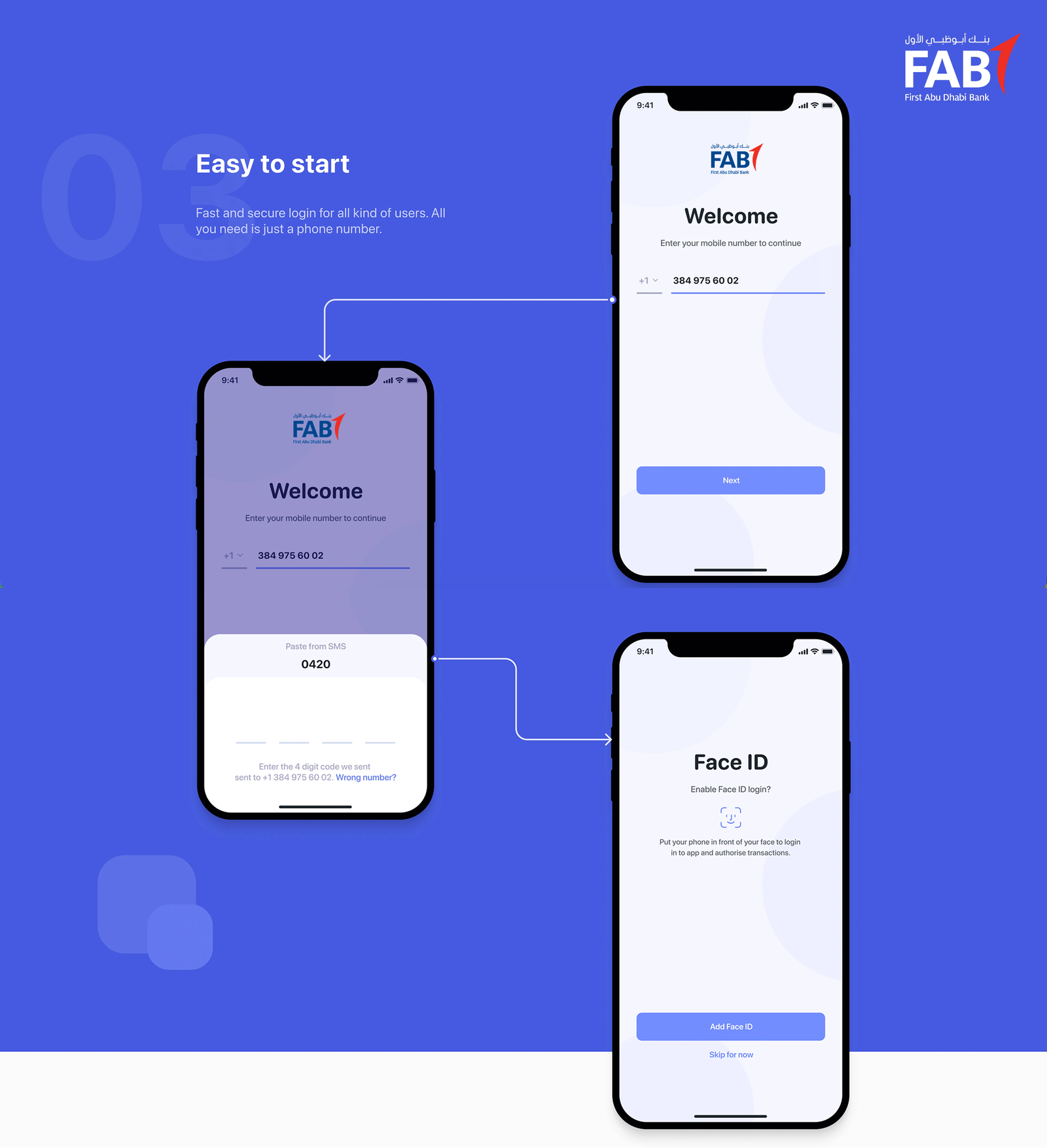
Easy to start

Fast and secure login for all kinds of users

The onboarding and login experience was designed to remove friction from the very first interaction. Instead of traditional, multi-step credential creation, we prioritised phone-number–based access as the primary entry point, reducing cognitive load and setup time.

From a design perspective, the focus was on:

  • Progressive disclosure – users are only asked for what is essential at each step.

  • Clear security feedback – OTP verification, biometric prompts, and system status are communicated with calm, reassuring microcopy and visual cues.

  • Accessibility and inclusivity – large tap targets, legible typography, and clear error states ensure the flow works for a wide demographic, including less tech-savvy users.

The result is a fast, confident first impression that balances ease of access with trust and security, critical for a banking product.

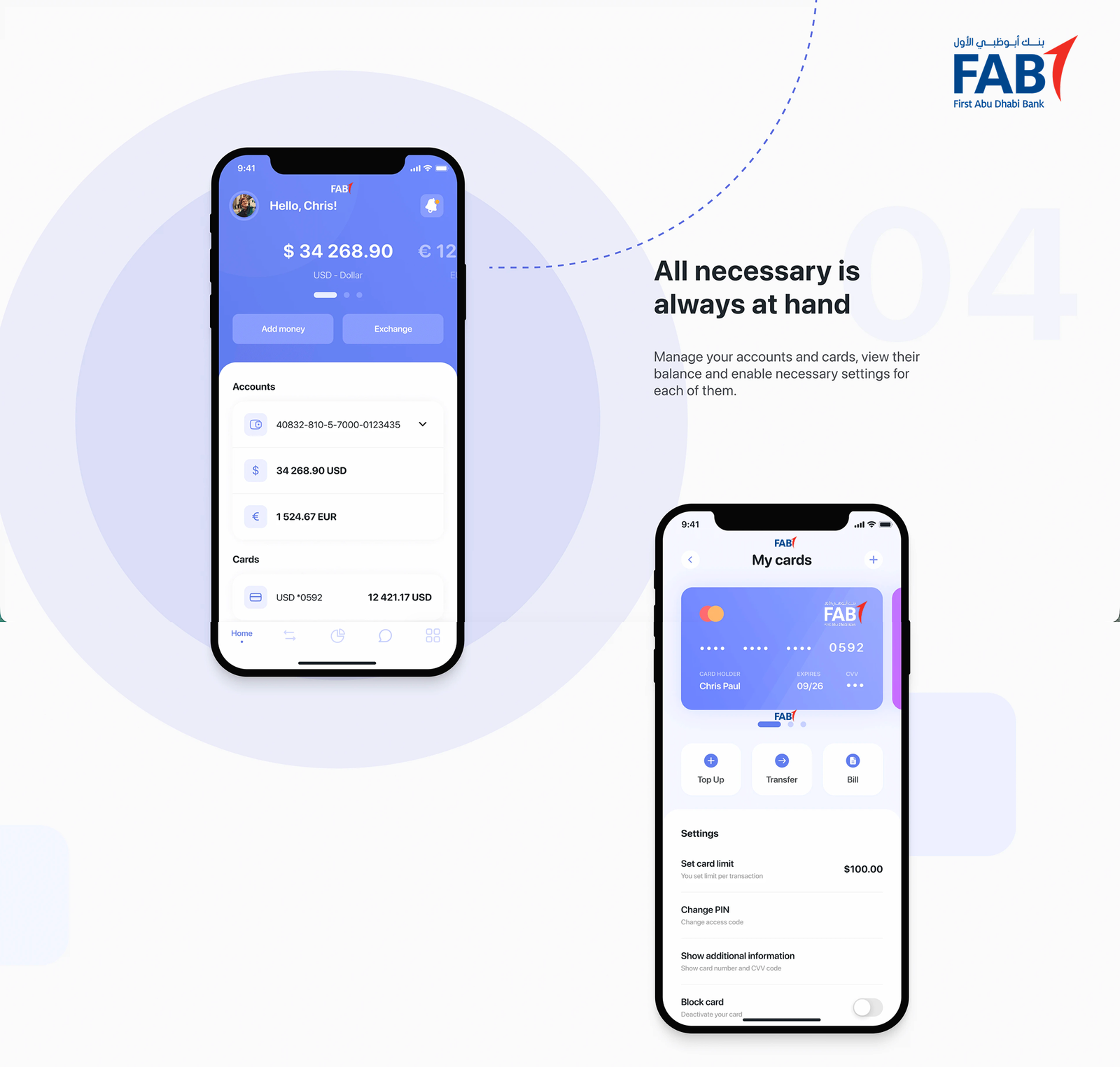
All necessary is always at hand

Accounts and cards at a glance

The home dashboard was designed as a command centre, giving users instant visibility and control over their finances without overwhelming them.

Key design considerations included:

  • Information hierarchy – balances, cards, and key actions are prioritised visually using spacing, typography scale, and card-based layouts.

  • Consistency across entities – accounts and cards follow the same structural patterns, reducing the learning curve.

  • Inline controls – essential settings (freeze card, view details, limits) are surfaced contextually, avoiding deep navigation.

This approach ensures users can quickly understand their financial position and take action within seconds of opening the app.

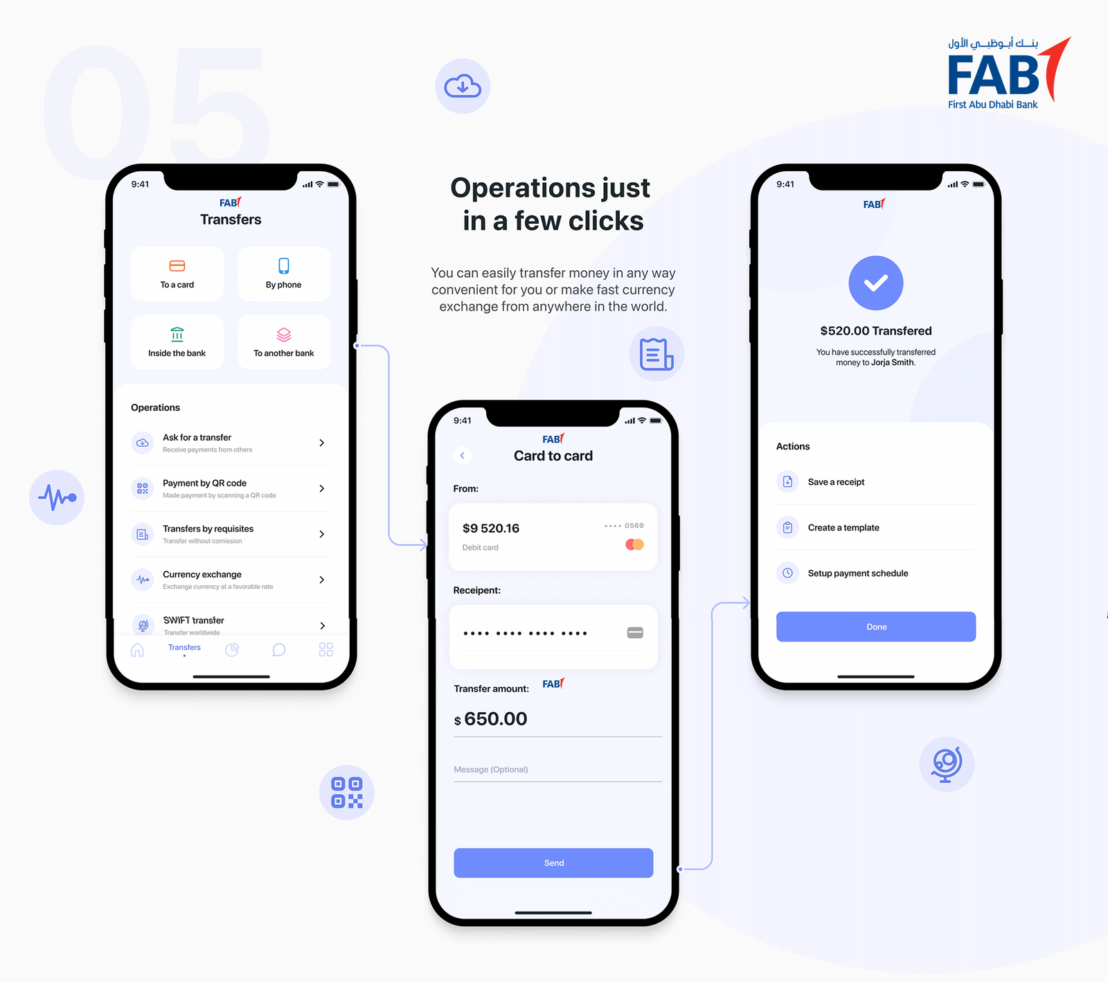
Operations in a few clicks

Transfers and currency exchange made effortless

Money movement is one of the most critical journeys in a banking app, so the design focused on speed, clarity, and confidence.

Design decisions included:

  • Guided flows with clear step progression, reducing anxiety around high-risk actions.

  • Smart defaults and shortcuts for frequent transfers, minimising repetitive input.

  • Clear confirmation states that visually reinforce success and reassure users before and after transactions.

For currency exchange, real-time rates and transparent fees are visually emphasised to build trust, allowing users to transact from anywhere in the world with confidence.

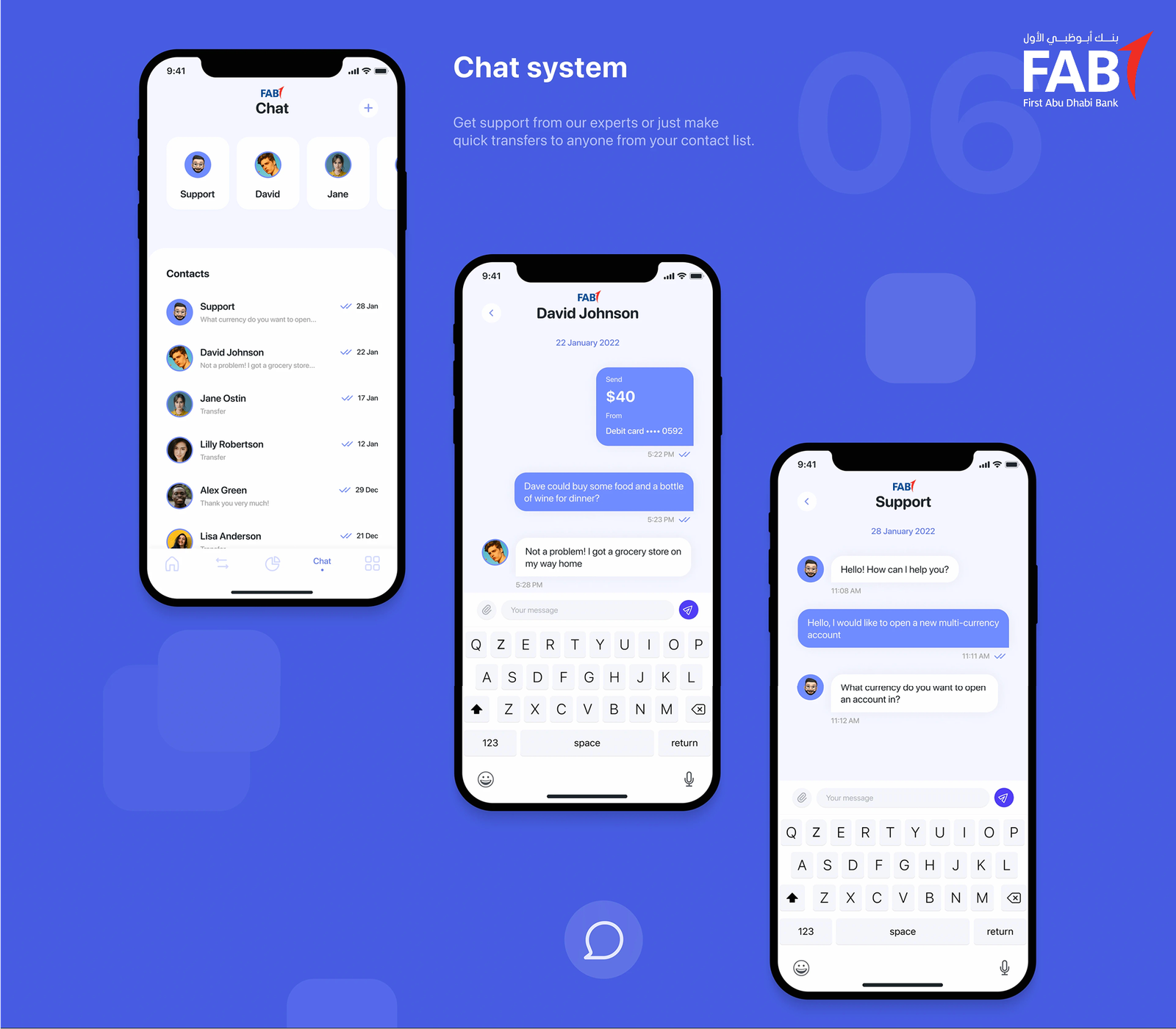
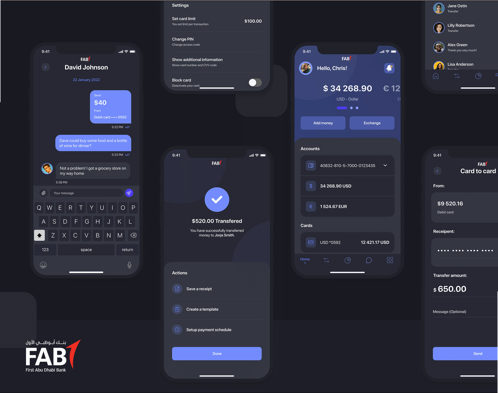
Chat system

Support and payments in one conversation

The chat experience was designed as more than customer support—it acts as a functional financial touchpoint.

From a UX perspective:

  • Conversational UI patterns reduce formality and friction when seeking help.

  • Context-aware actions allow users to make quick transfers directly within chat, blurring the line between communication and transaction.

  • Clear differentiation between system messages, support agents, and user actions ensures clarity and avoids mistakes.

This design turns chat into a fast, human, and practical tool rather than a last-resort support channel.

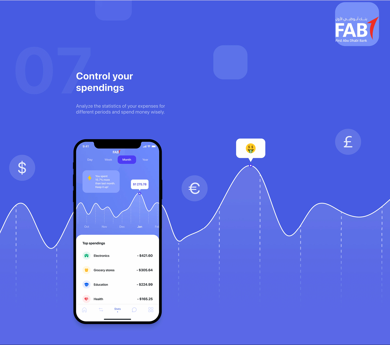
Control your spendings

Clear insights, not overwhelming data

Expense analytics were designed to help users understand and reflect, not just observe numbers.

Design principles applied:

  • Visual storytelling through charts and categories that adapt to different time ranges.

  • Progressive complexity – high-level summaries first, with the ability to drill down when needed.

  • Behavioural nudges using subtle copy and visual emphasis to encourage smarter spending habits.

The result is a feature that supports financial awareness without judgement or unnecessary complexity.

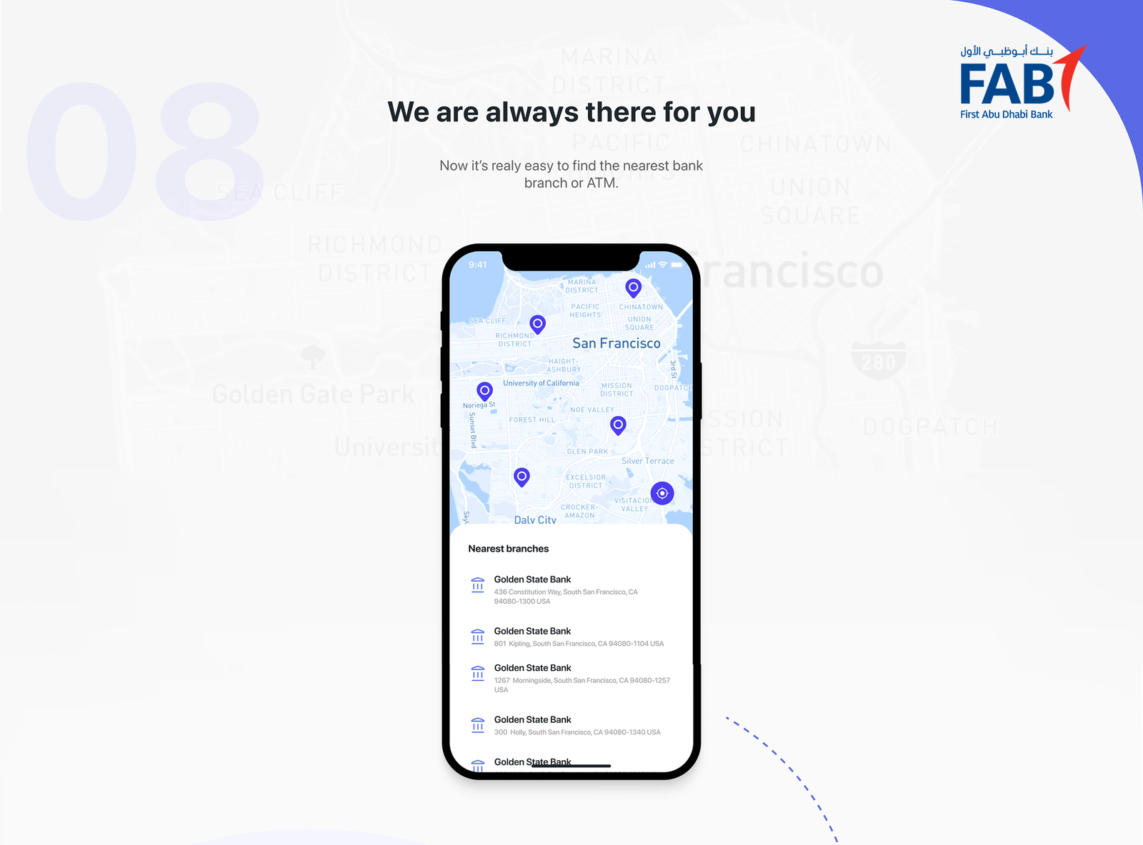
We are always there for you

Finding branches and ATMs effortlessly

The branch and ATM locator was designed to feel immediate and reliable, especially for users on the move.

Design considerations included:

  • Map-first experience with clear visual markers and distance indicators.

  • Contextual actions such as directions or contact details surfaced at the right moment.

  • Minimal UI chrome to keep focus on location and accessibility.

This ensures users can quickly solve real-world problems without friction.

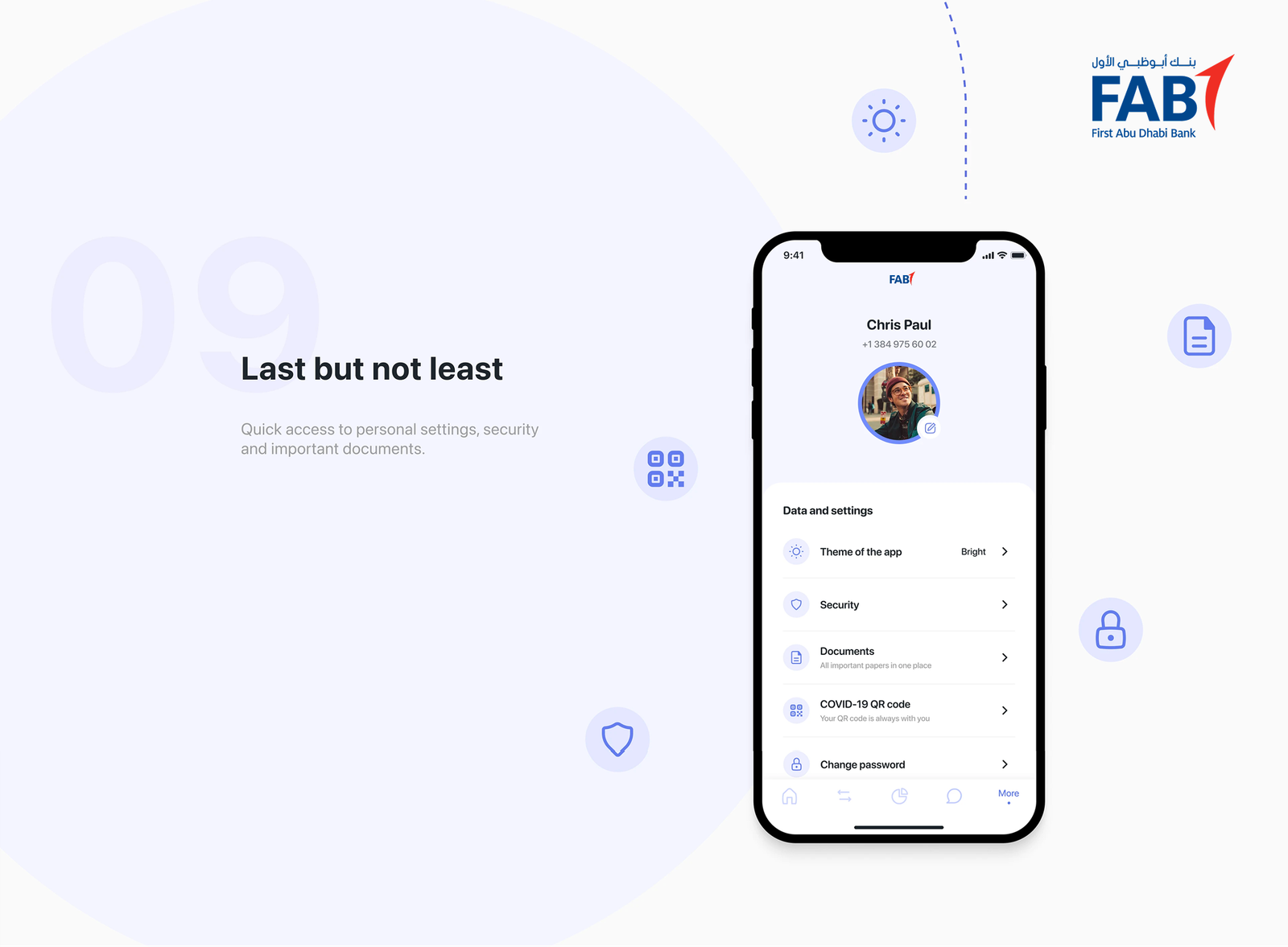
Last but not least

Personal settings, security, and documents

The settings area was intentionally designed as a calm, structured environment that contrasts with the transactional parts of the app.

Key design decisions:

  • Logical grouping of personal details, security options, and documents to support mental models.

  • Clear security affordances for sensitive actions, using visual separation and confirmation steps.

  • Document accessibility designed for quick retrieval without clutter.

This reinforces a sense of control and transparency, essential for trust in a financial product.

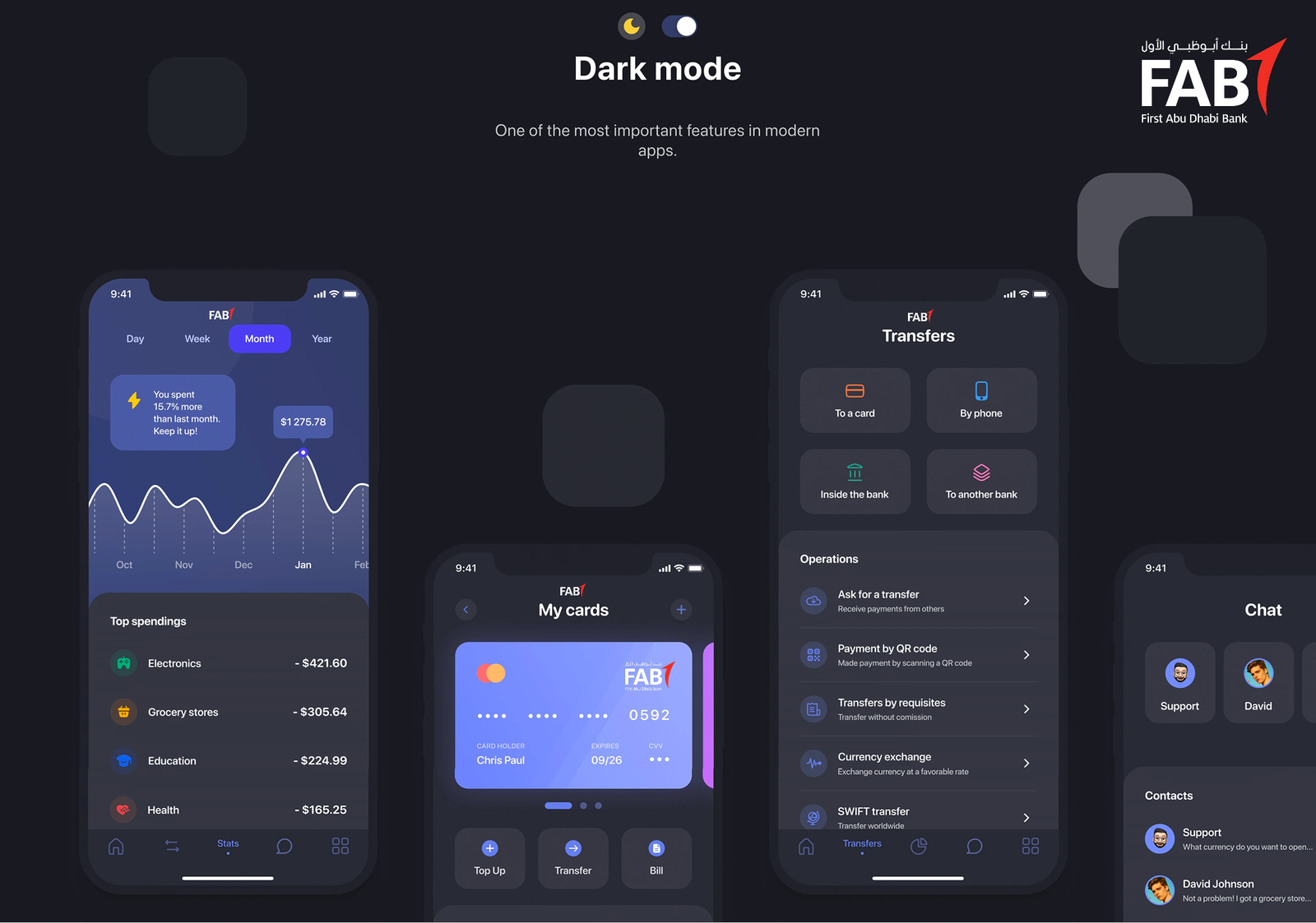
Dark mode

Designed, not inverted

Dark mode was treated as a first-class experience, not an afterthought.

From a design standpoint:

  • Colours were re-balanced to maintain contrast and hierarchy, not simply inverted.

  • Shadows, elevations, and dividers were adjusted to preserve depth and readability.

  • The mode supports both aesthetic preference and eye comfort, especially in low-light environments.

This ensures visual consistency, accessibility, and modern expectations are fully met.

Final Designs

The final UI brings together usability insights and brand coherence. Key design decisions included:

  • Streamlined dashboard with top-level account summaries and quick actions.

  • Clear navigation with core items accessible at all times.

  • Enhanced visual hierarchy ensuring focus on important tasks.

  • Biometric login and security feedback integrated into core flows.

Handoff & Implementation

Design specifications and assets were delivered to development teams through Zeplin, accompanied by annotated guidelines and interactive videos to clarify motion and interaction expectations. Continuous support was provided throughout development to ensure fidelity to the design vision.

Challenges & Solutions

Vector Assets on Android
Issue: Some vector icons didn’t render correctly on Android.
Solution: Converted and optimized vector XML nodes manually before implementation.

Feature Complexity
Balancing >50 banking features in the app required prioritisation and progressive disclosure to prevent cognitive overload. Iterative user feedback helped refine information density.

Success Metrics

Post-launch analytics and feedback showed significant improvements:

  • User engagement growth up to 42%.

  • Transaction flows streamlined, reducing completion times by ~20%.

  • Enhanced app store ratings and user satisfaction.

These outcomes confirmed strong alignment between UX design solutions and user needs.

Key Takeaways


Early user research and stakeholder alignment were fundamental to defining meaningful features.

Iterative testing and refinement ensured designs were grounded in real user behavior.

Close collaboration with engineering smoothed implementation challenges and improved final quality.

  • Previous ProjectSainsburys / Smartshop App

  • Next ProjectThe AA / Breakdown cover

Share